Project Overview
Costa Rosa
A new tide in seafood gastronomy.
Client
Cosa Rosa
Industry
Restaurants
Focus
Brand Identity, Packaging Design
Costa Rosa emerges as a fresh and thoughtful response to the traditional imagery of seafood cuisine. The project aims to shift the narrative from one that is typically rustic and casual to something more refined, warm, and timeless.
The challenge was to build an identity that retains the accessibility and familiarity of a seafood spot while reimagining it through a more polished, evocative, and serene lens. Costa Rosa offers more than a culinary experience — it creates a moment of pause and pleasure, as if time were suspended by the sea at sunset.
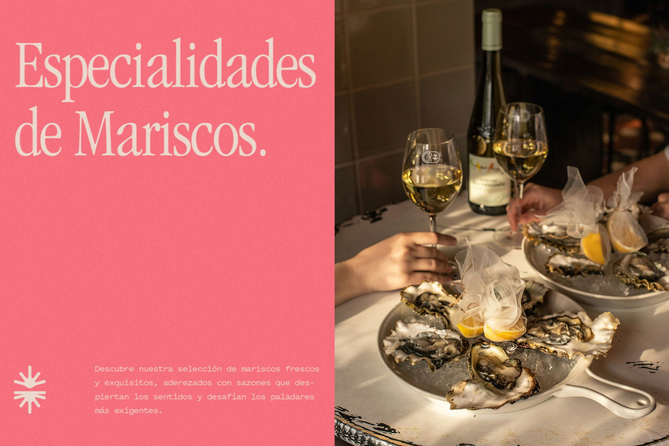
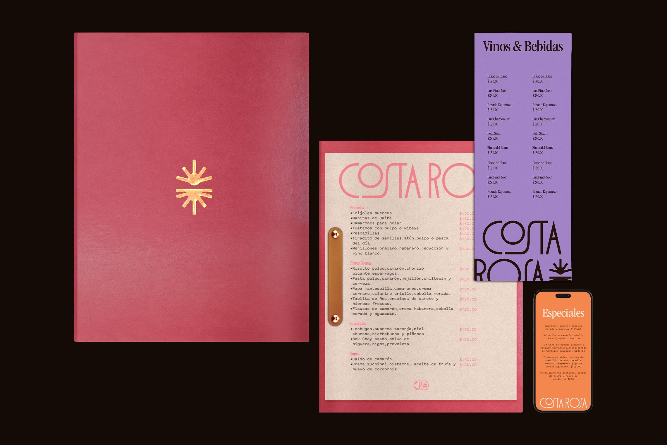
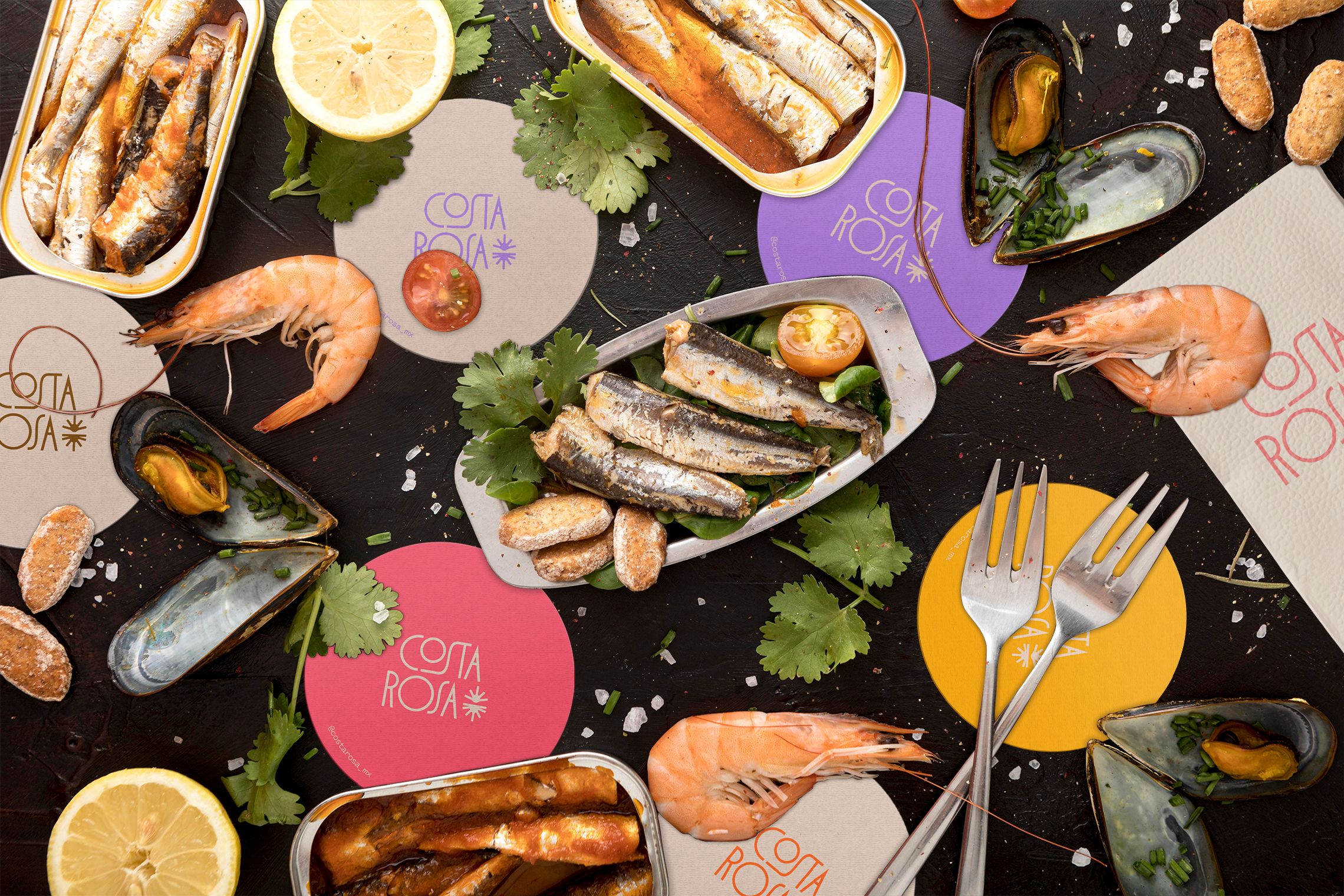
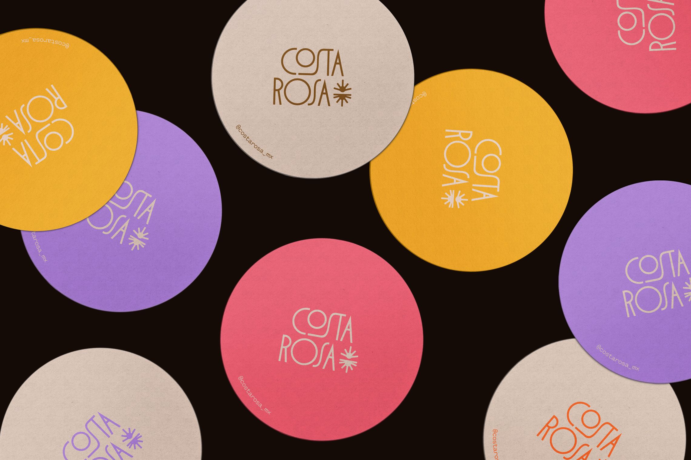
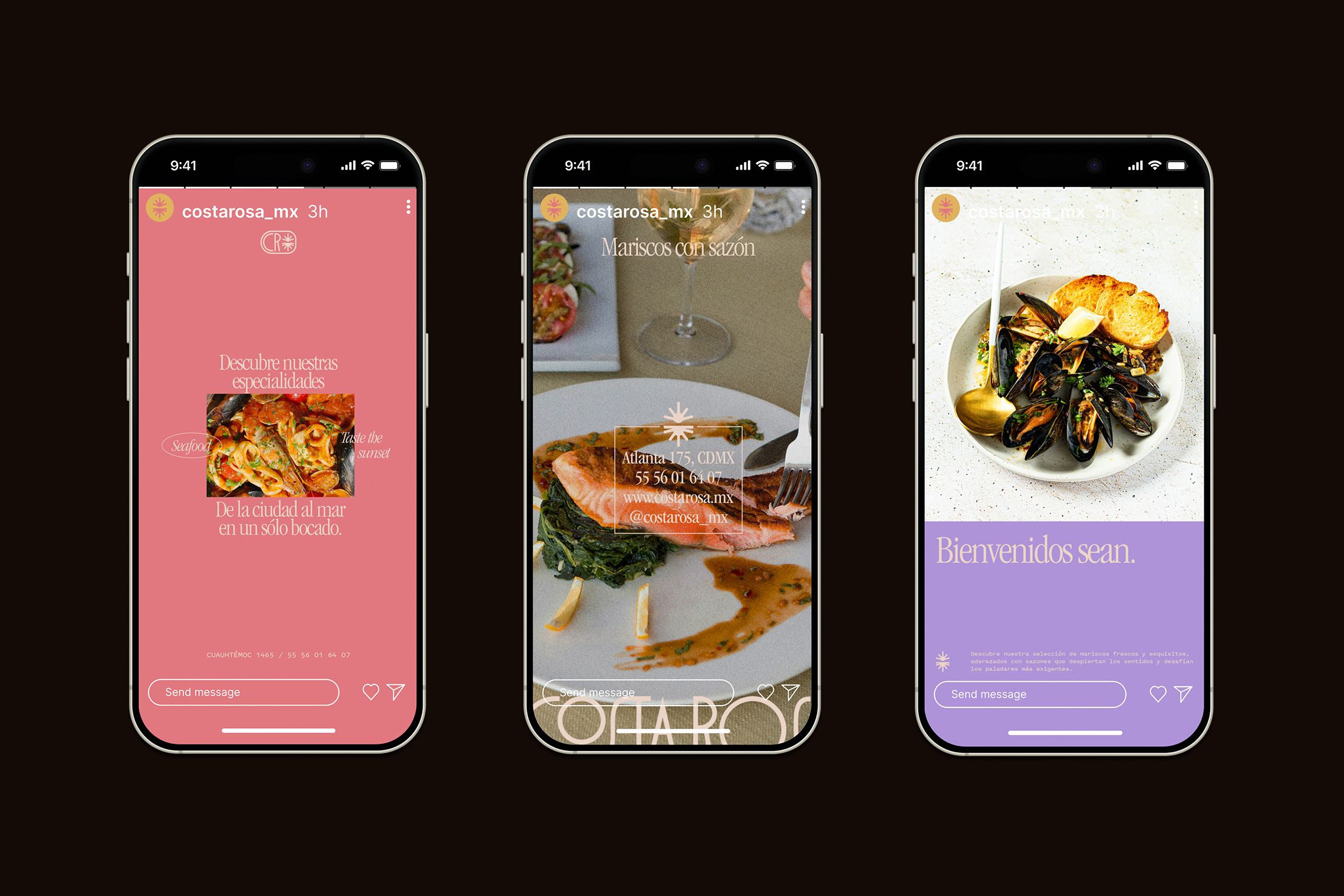
Inspired by the calm of dusk and the quiet beauty of the ocean, we developed a visual universe where elegance is felt effortlessly. The brand comes to life through refined typography, a warm and positive color palette, and a graphic system that invites rest, indulgence, and connection.
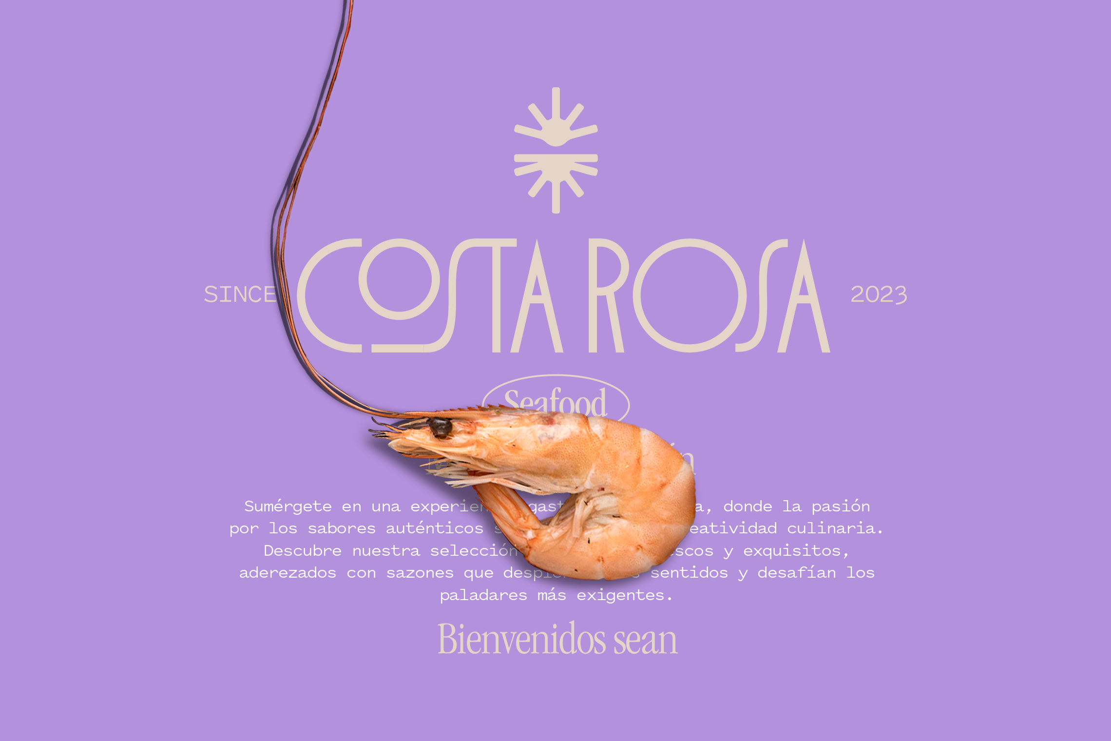
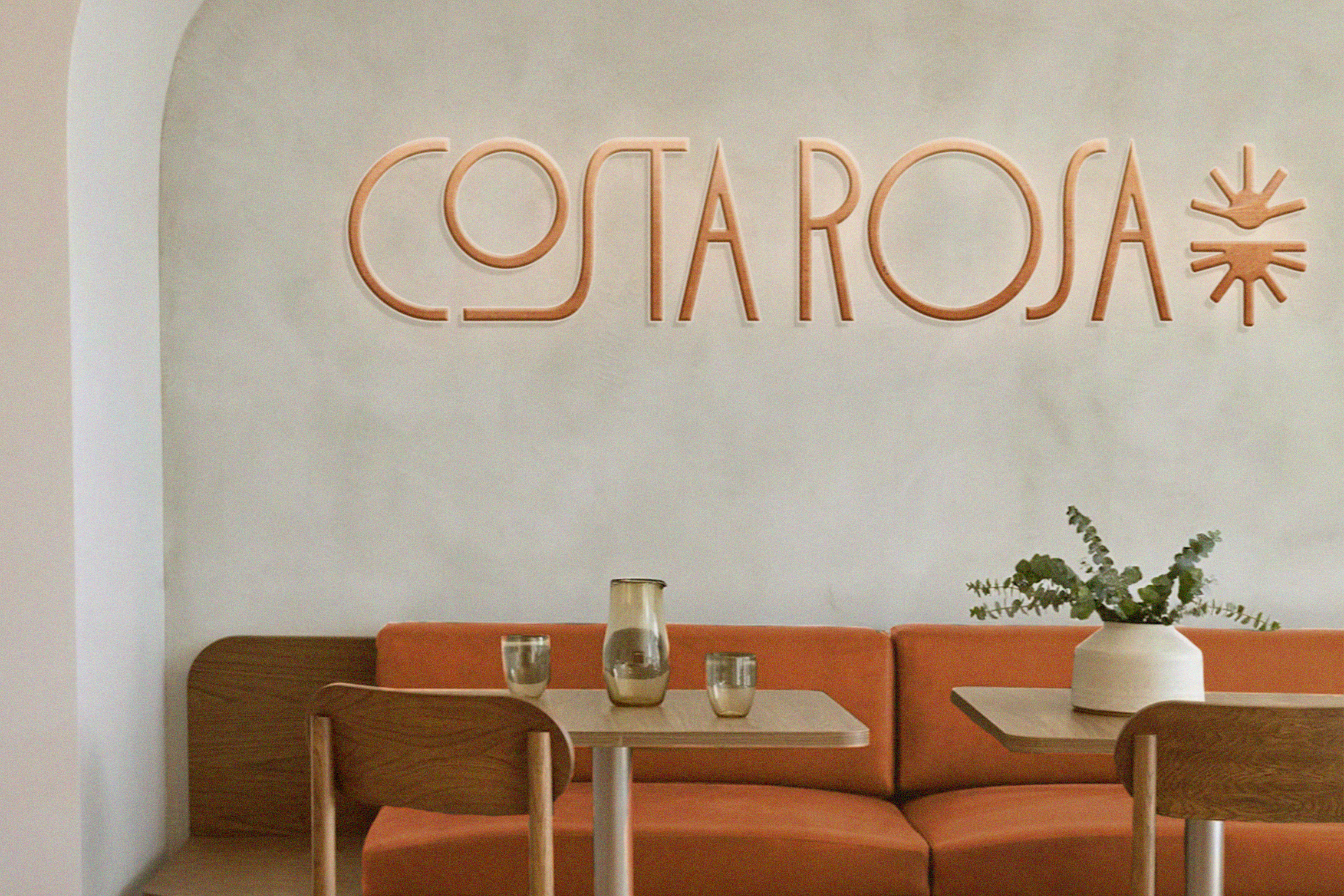
The logo, composed of soft lines and balanced proportions, reflects this intention: to capture the natural grace of simplicity. The icon, an abstract blend of sun and horizon, works as a poetic symbol of what Costa Rosa stands for — a place where time slows down, food brings comfort, and the experience lingers.
Visual compositions are built from layered textures, imagery, and typography that speaks with both clarity and emotion.
Costa Rosa is, at its core, an invitation to experience the sea from a new perspective.
