Project Overview
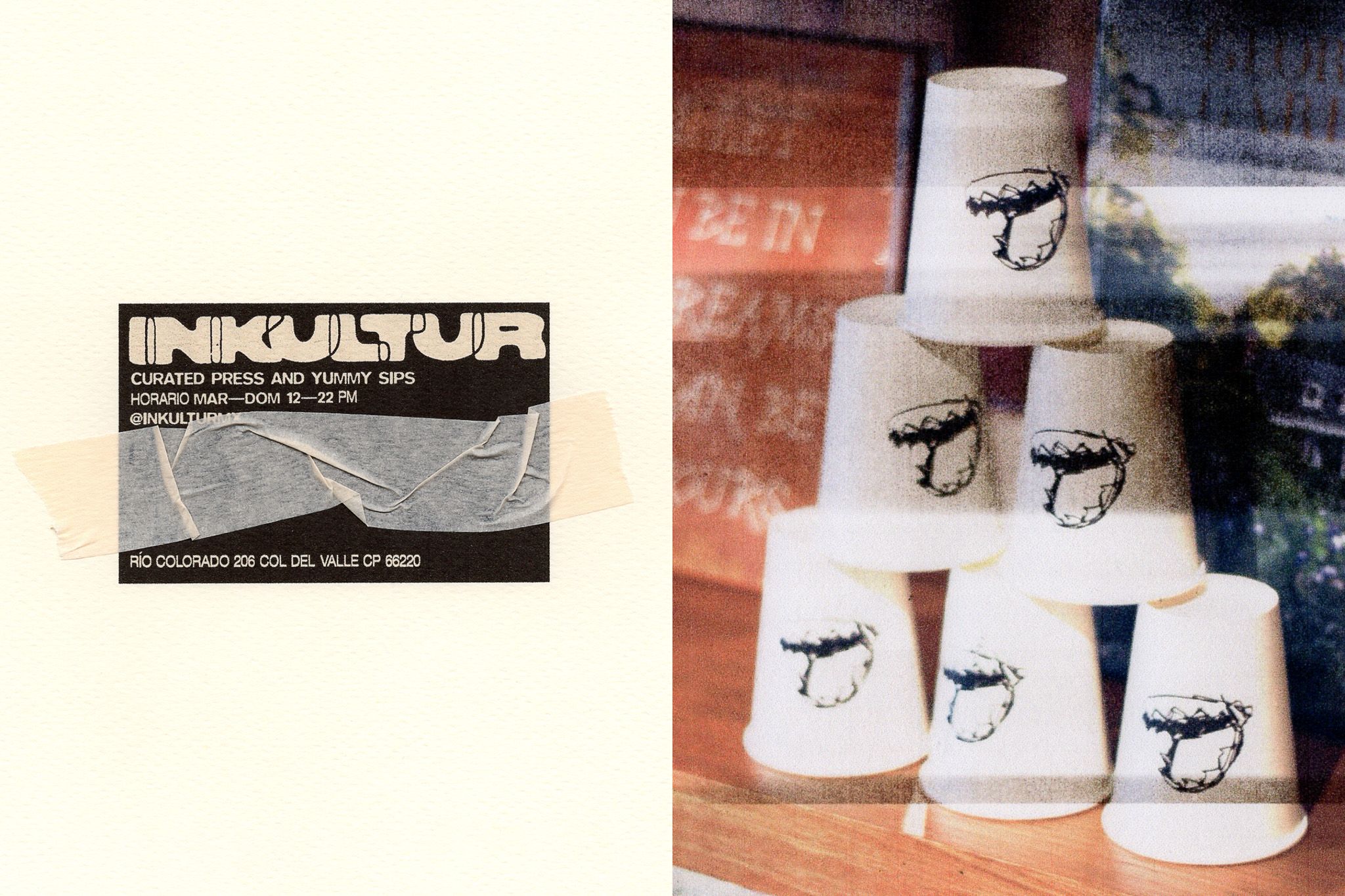
Inkultur
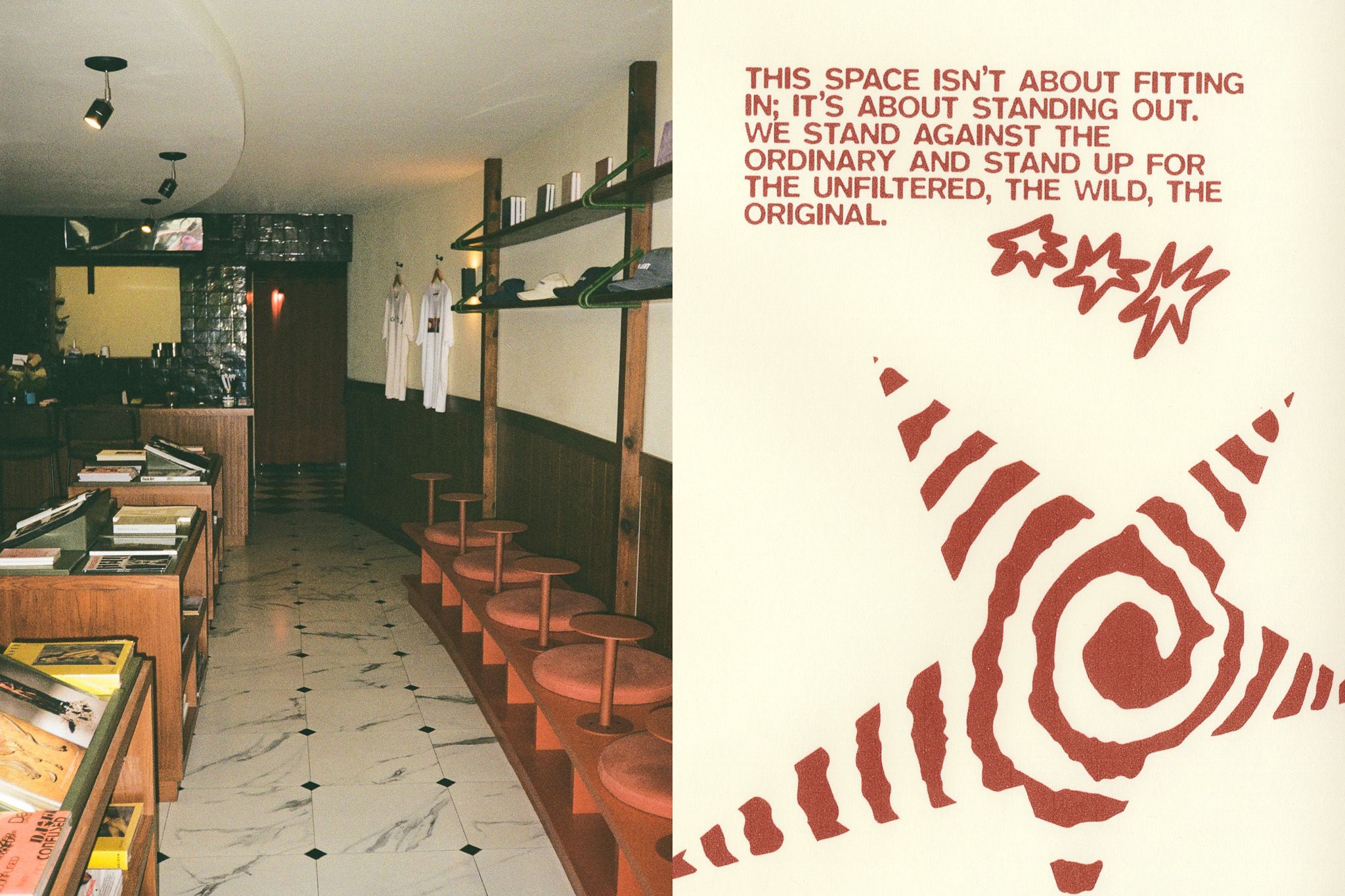
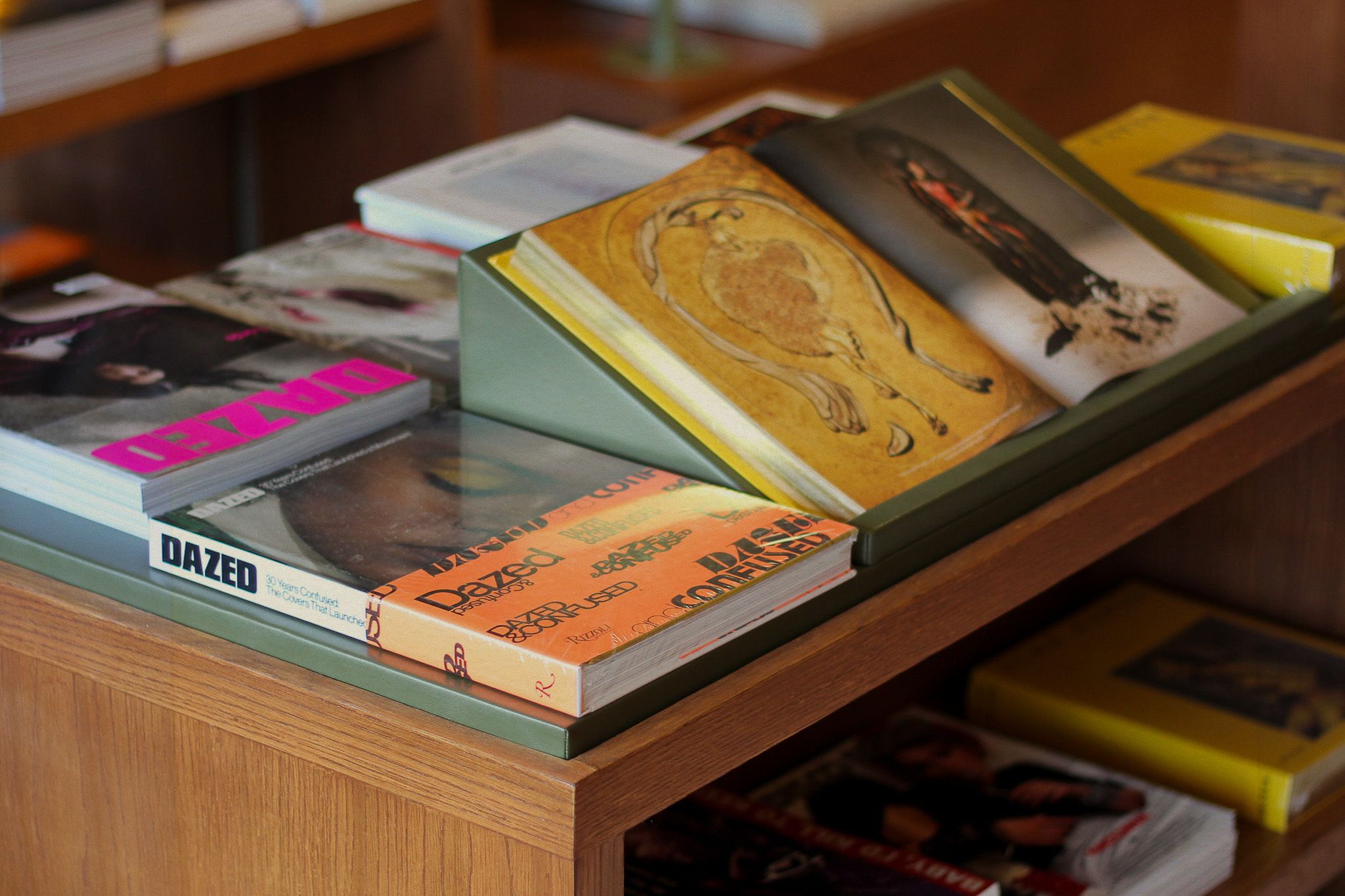
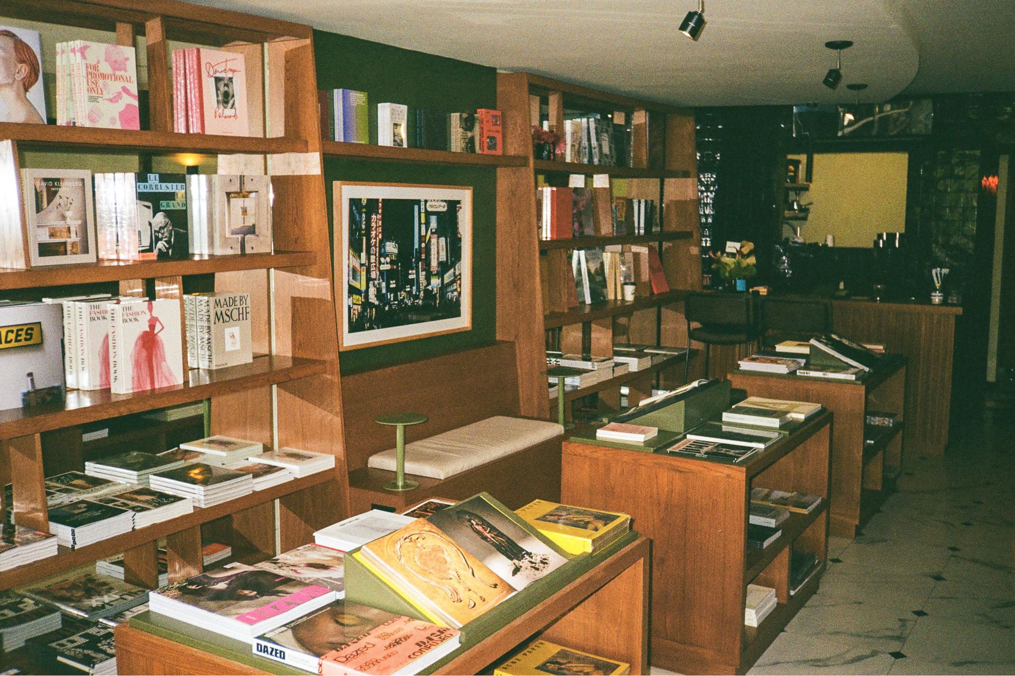
A space where print resists the digital era and celebrates the tangible and authentic.
Client
Inkultur
Industry
Restaurants
Entertainment
Focus
Naming, Brand Identity, Brand Applications
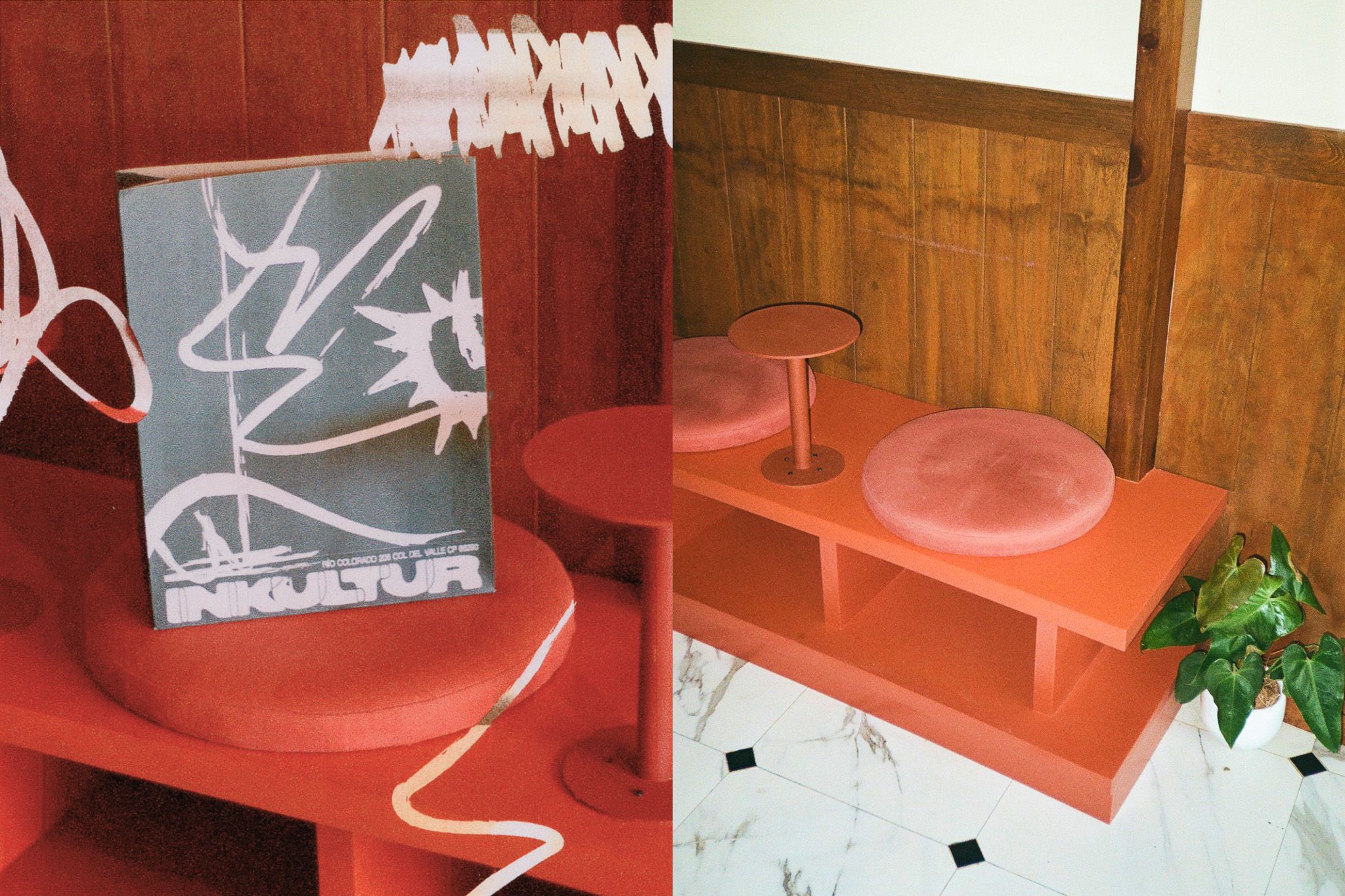
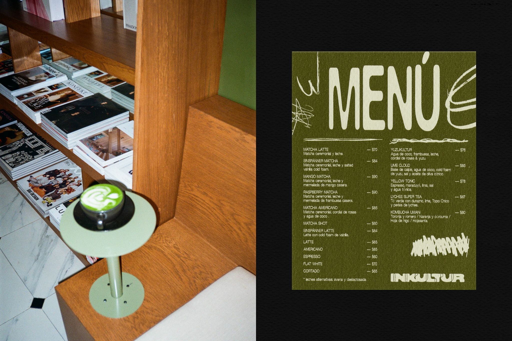
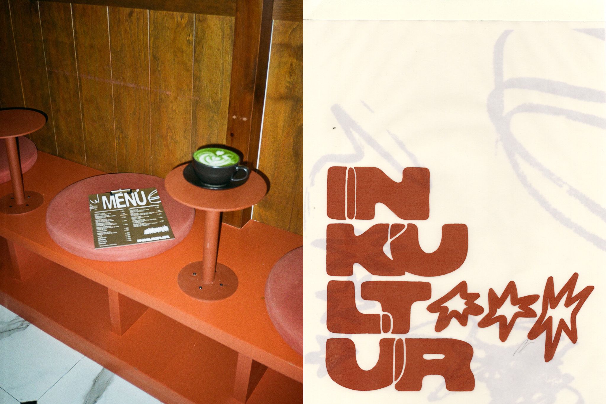
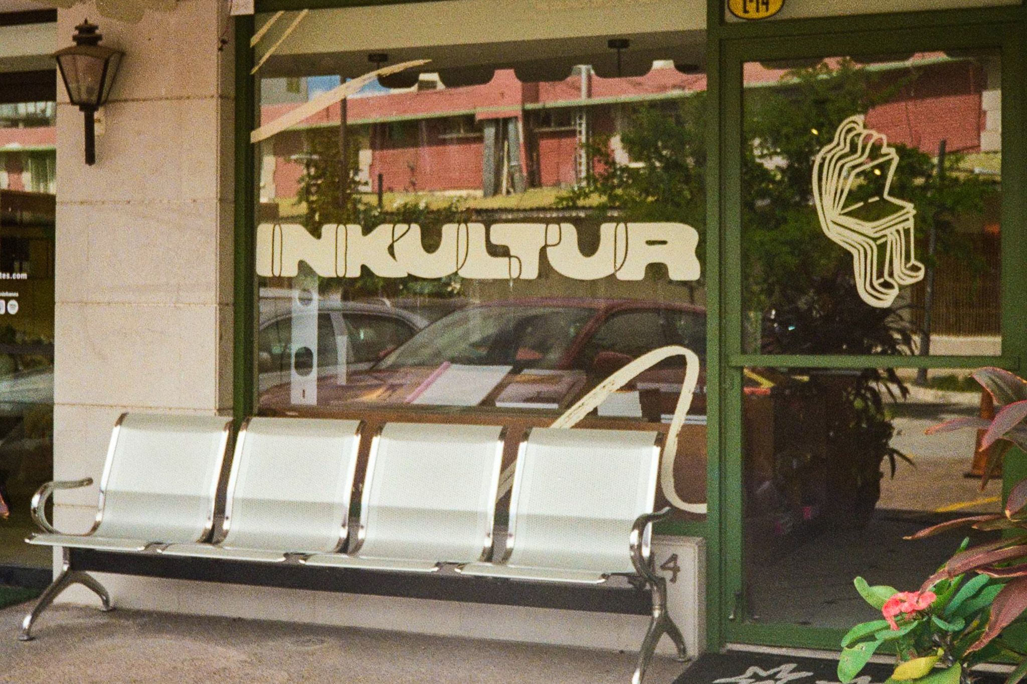
Its concept is rooted in authenticity and rebellion, offering a space for those who seek to connect with the tangible, the creative, and the unexpected. The experience is enhanced by carefully crafted beverages that complement the brand’s sensory universe.
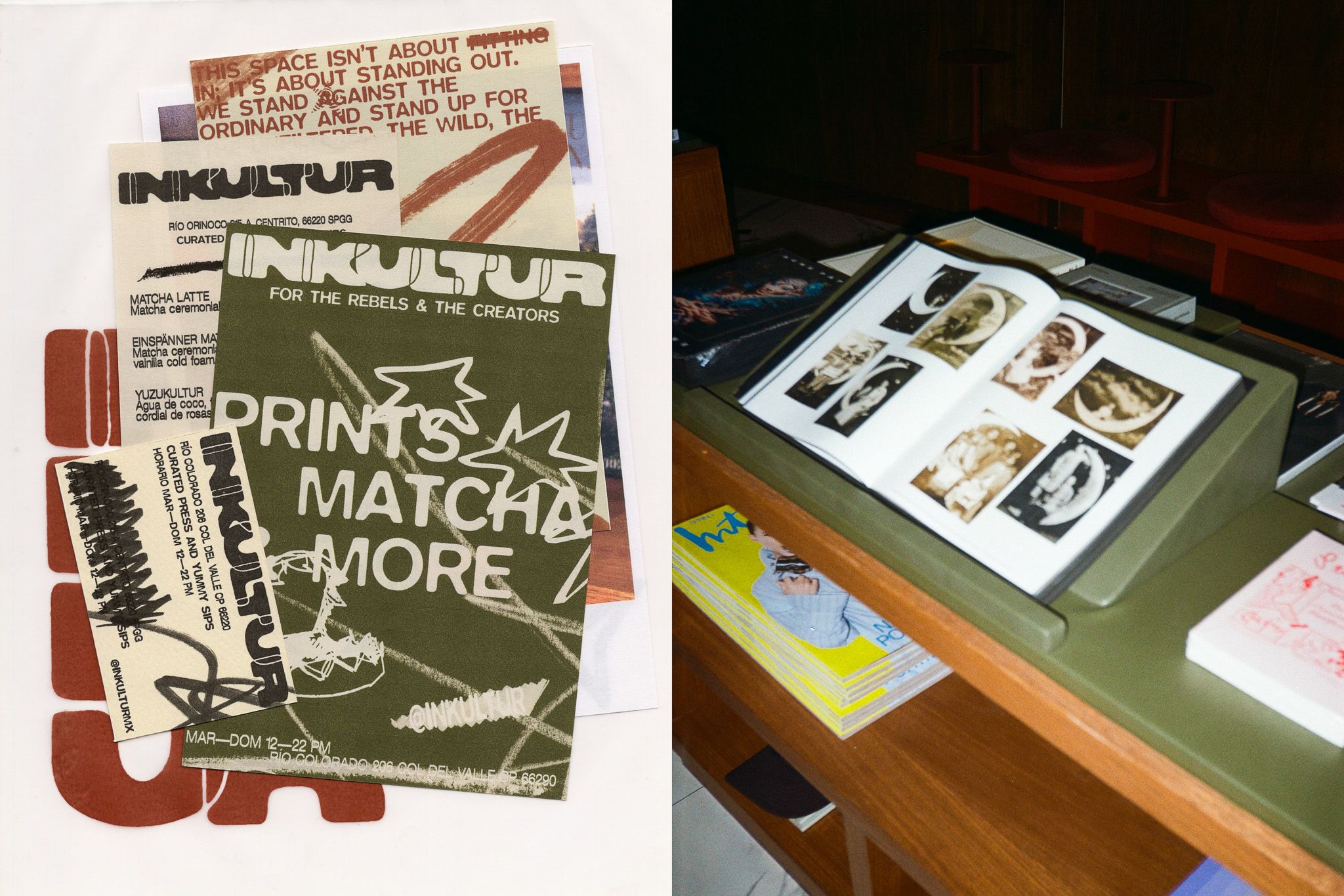
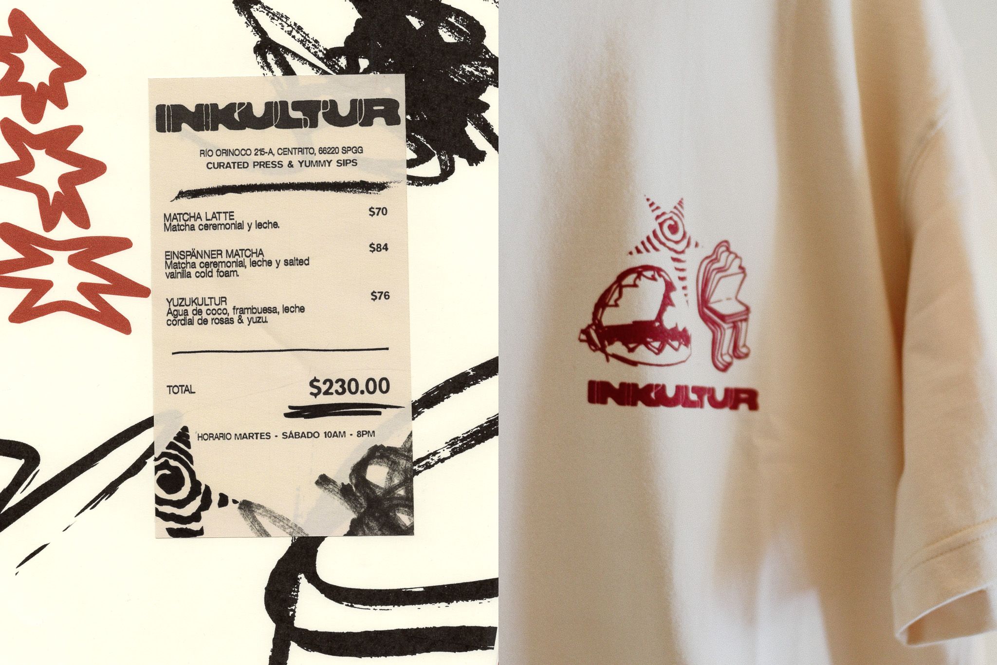
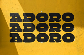
The logo, with irregular strokes and a hand-drawn style, reflects deliberate imperfection and Inkultur�’s countercultural spirit, evoking the DIY aesthetic and free expression. This approach is expanded through a versatile system of icons, each with its own personality, reinforcing the brand’s disruptive identity and adding visual richness to its universe.
The color palette combines warm, earthy tones with vibrant accents that break the rules, creating a cozy yet bold and memorable aesthetic. Every element, from typography to icons and their application across spaces and products, contributes to a coherent, authentic, and visually stimulating experience.