Project Overview
MPOISED
A clothing brand that sees movement as a form of expression.
Client
Mpoised
Industry
E-Commerce
Wellness
Focus
Brand Identity, Art Direction, Web E-Commerce Design, Packaging Design
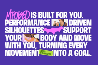
MPOISED emerges as an extension of the Mamaxita universe, expanding its language into new forms of expression that go beyond skincare. The brand introduces clothing as part of a personal routine, understanding self-care not only through care itself, but through identity, attitude, and the way each person presents themselves to the world. More than a complementary line, MPOISED positions itself as a daily ally, connecting with a freer, more confident, and expressive version of those who choose it.
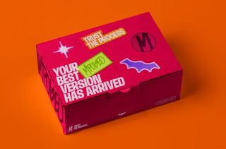
The visual identity is built around a logotype that blends structure and gesture. A bold typographic base is subtly intervened with strokes that replace certain characters, creating a looser rhythm and a visual language that feels less constrained and more intuitive. This approach maintains a clear connection to its sister brand while introducing a more irreverent and dynamic personality.
The system is supported by graphic elements with strong character, such as the bat, which serves as a distinctive and memorable symbol. In parallel, a reinterpreted “M” acts as a direct nod to Mamaxita, reinforcing the connection between both brands without limiting its individuality.
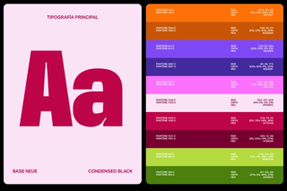
The color palette takes inspiration from the tones of the garments, embracing a vibrant selection that breaks away from what is typically expected within the category. These colors not only complement the product but also build a fresh, expressive atmosphere full of personality.
The typographic system combines contrasting weights and styles, creating compositions with greater rhythm, movement, and presence. The result is a flexible, expressive identity that maintains coherence without losing spontaneity, accompanying the brand as it naturally expands into a broader territory where self-care is also worn.